Bootstrap Responsive Web Design
In web world, responsive web is an approach to design web application that can adapts the layout to the viewing environment. In other word, responsive web design is an approach to maximize the accessibility and user experience. With the growing trends of different screen sizes across phones, tablets and desktops screen sizes will always be changing, so it's important that your site can adapt to any screen size, today or in the future.
Responsive web design has become more important as the amount of smart phone traffic now accounts for more than half of total internet traffic.
So, responsive web design is a preferable alternative to target a wide range of devices with much less efforts. It's automatically change layout to any screen size, whether it is a desktop, a laptop, a tablet, or a mobile phone.
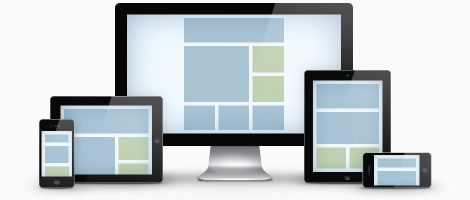
Bootstrap Responsive Layout
With the release of version 3, Bootstrap has gone mobile first, building on its already responsive base. Bootstrap mobile first styles can be found throughout the library no need to add separate files. Its provides better control over the layout which rendered on different types of devices like phones, tablets, desktop and laptops devices etc.
To ensure proper rendering, add the viewport meta tag to page <head> section.
Bootstrap Responsive Layout Example
The following example shows single button dropdown:
See Live Example