Bootstrap Fixed Layout
In previous version of Bootstrap (version 2), you had to use row-fluid inside a fluid container and row inside a fixed container. In Bootstrap 3, row-fluid was removed and no longer use it. Bootstrap 3, media queries are all included. You just need to decide if you want to use a fixed width or fluid width layout for your page.
Create Fixed Layout
The process of creating the fixed yet responsive layout starts with the .container class. Next, add rows within a .container using .row class. Further column can be created using grid classes like .col-xs-*, .col-sm-*, .col-md-*,.col-lg-* . Here '*' represent grid number.
Bootstrap Fixed Layout Example
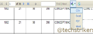
The following example shows single button dropdown:
See Live ExampleThe above Bootstrap Fixed Layout example will produce below output: